
Bronnitsy Jewelry
Rebranding of the largest private jewelry network in Russia with a 100-year history. Identity, tonality of communication, packaging, design of boutiques interior.
Bronnitsy Jewelry is the largest manufacturer of gemstone jewelries with its historical location in the city of Bronnitsy and a sales network of 60 shops across the whole country.

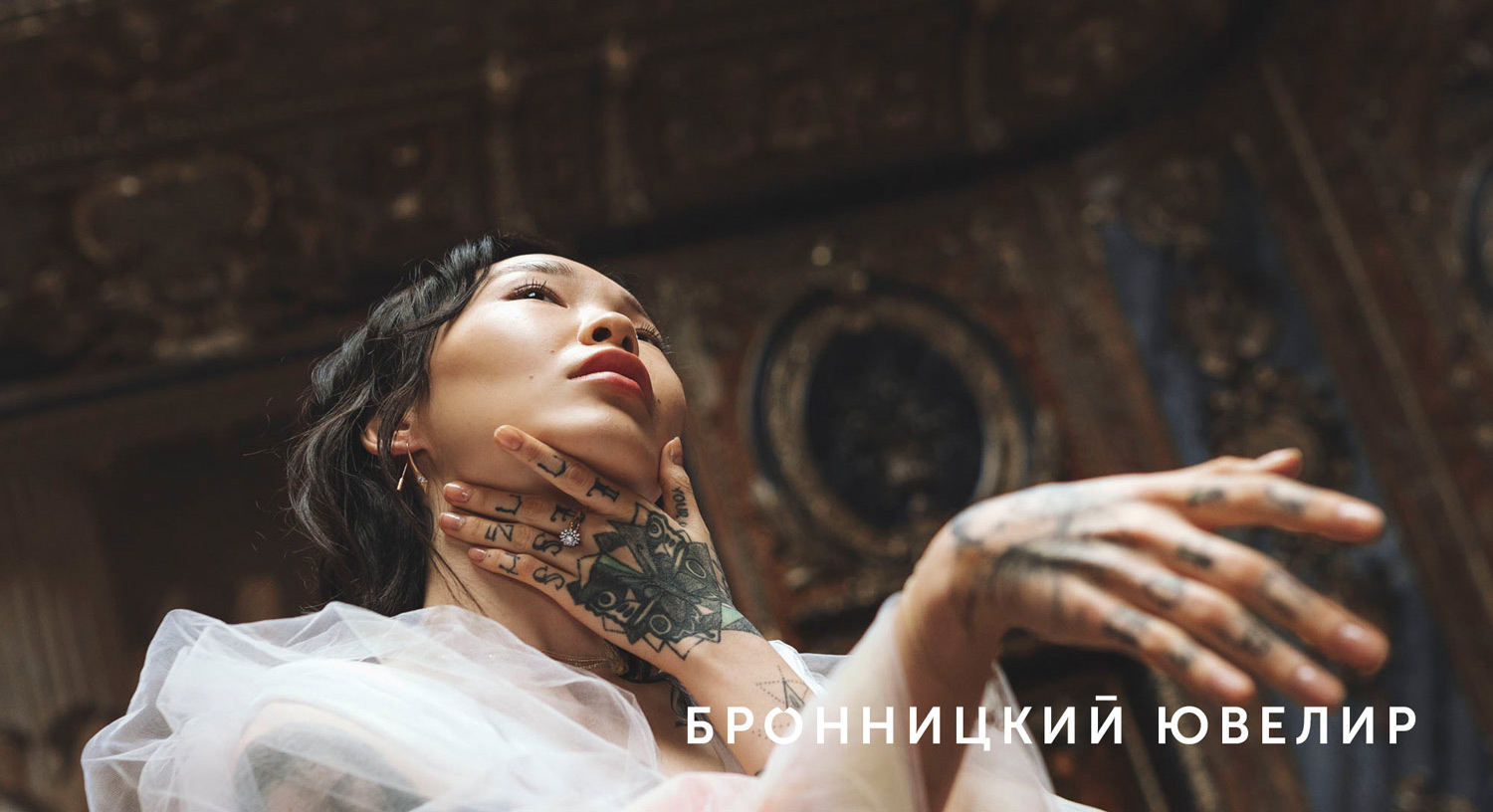
We created a modern fashion brand which is a break-through creating the daring space for collaborations, for the branding of current and limited-edition collections.
Watch the video:

“Our agency had a difficult task - to make the historical brand look modern and fashionable, to find an approach to a new target audience, the generation of millenials.”
КOMMERSANT STYLE, JULY 29, 2019


Brand pattern
To address the modern consumer generation a new, bolder visual communication is needed. Therefore, when rebranding, we focused on the typographic concept. The symbol of the renewed brand was the letter “O” reminding a ring with a diamond.


Bronnitsky Jeweler is a combination of history, innovation, youth and creativity.
We made a daring poster design for all corporate elements and developed a corporate type.

“A character font is something which always keeps your up-to-date. Fashion, context, collections – everything changes. But the font may remain a corporate signature for a very long time, its brand style, this is a way of direct communication, some kind of personal communication - Nikita Gorbunov says.

Bronnitsy Jewelry is one of the oldest jewelry factories in Russia. Its product range includes over five thousand items of jewelry (585° and 375° gold), as well as silver jewelries (925° silver).


The interior design features a combination of rough textures and neon accents. For the customer convenience the jewelry inside the hall is dived into 14 collections to make it easier for clients to choose a similar style sets. In addition, the boutiques now have lounge and selfie area and offer a fundamentally new jewelry art space.


New minimalistic packaging for jewelry.